User Interface
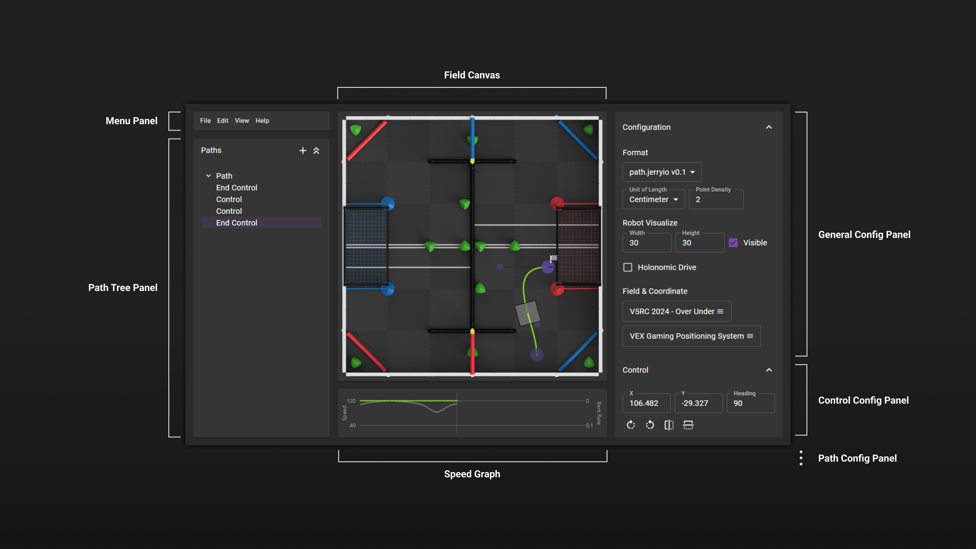
PATH.JERRYIO has a user interface and layout similar to many other path editors and path planning tools. The editor is divided into three sections: the left section contains the application menu and path tree, the middle section contains the path editor, and the right section contains all the config panels.
Panels
PATH.JERRYIO comes with a simple and intuitive user interface. The user interface is divided into three sections and each section contains one or more panels. A panel is a container for displaying editor and configuration information. Sometimes, a panel can be expanded or collapsed by clicking on the panel header:
- Field Canvas - The main canvas for drawing the paths.
- General Config Panel - The panel for general configurations, for example, which format to use, unit of length, point density, etc.
- Config Config Panel - The panel for control configurations, for example, x and y coordinates, heading, etc.
- Path Config Panel - The panel for path configurations, for example, minimum and maximum speed, etc.
- Menu Panel - The panel for menu items.
- Path Tree - A hierarchical representation of the paths and controls in the editor. The path tree can be used to select and edit paths and controls.
- Speed Graph - A graphical representation of the speed profile of the selected path. The speed graph can be used to edit the speed profile by adding speed keyframes on the graph.
Layouts
PATH.JERRYIO has multiple layouts that can be selected from the application menu, including the classic layout, the exclusive layout, and the mobile layout. Not all the layouts are available on all window sizes. The most suitable layout will be selected automatically based on the window size of the browser.
The classic layout is the default layout. The exclusive layout is a layout that is designed for users who have a large screen. The exclusive layout is similar to the classic layout, but it has a larger path editor, and all other panels are hidden by default. The mobile layout is a layout that is designed for mobile devices.
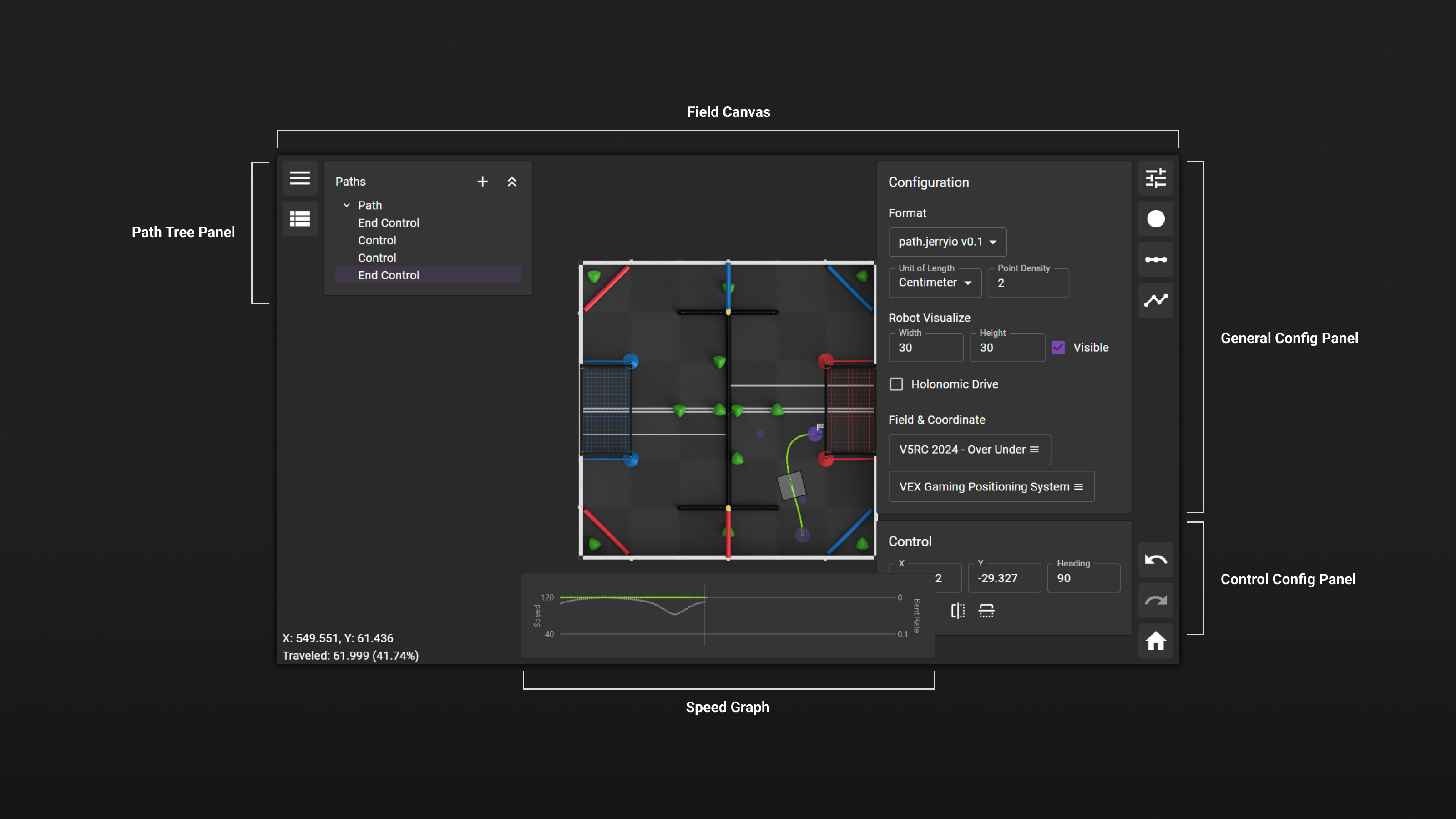
In the exclusive layout, all panels are hidden by default and can be opened by clicking on the panel icons from the left or right sidebar. All the panels are floating on top of the path editor and listed on the left side or right side, similar to the classic layout.
Although the mobile layout is designed for mobile devices, all the layouts support touch screens and trackpads.
General Config Panel
The General Config Panel contains all the general configurations for the editor, including all the default settings and additional settings from the format you are using:
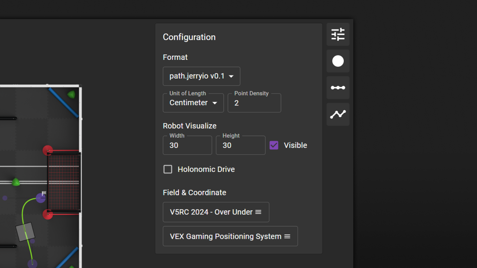
- Format - The format of the path file. The format can be changed at any time, and the editor can automatically convert the path file to the new format.
- Unit of Length - The unit of length used in the editor. All the input fields and information related to coordinates and distances are presented in this unit. The default unit of length is based on the format you are using. For example, the path.jerryio format uses centimeters by default, and the LemLib format uses inches. The unit of length can be changed at any time, and the editor can update all the input fields to adapt to the new unit of length. However, it doesn't affect how the output path file is generated.
- Point Density - The spacing between two waypoints on the path. The point density is based on the unit of length setting. For example, if the unit of length is set to centimeter, then a value of 2 means 2 centimeters. It is a computable input field.
- Robot Size - The size of the robot visualized in the editor and based on the unit of length setting. The input fields are computable input fields.
- Robot Visible - Whether the robot is visible in the editor. After setting this to true, the robot will be visible in the editor when hovering the mouse over the selected path, which allows you to see the robot's position and orientation along the path.
- Holonomic Drive - Whether the robot is holonomic. If the robot is holonomic, it can move in any direction without changing its orientation. If the robot is not holonomic, it can only move in the direction it is facing. This is used for robot visualization in the editor only. When this is set to true, the heading of the robot will be referenced to the heading attribute of the end controls in the current segment.
- Field Layer - The field image used in the editor. It can be customized by uploading a new image. See more details in the Asset Manager section.
Control Config Panel
The Control Config Panel allows you to inspect and enter the x and y coordinates of the control points. It is only available when exactly one control point is selected. When multiple control points are selected, the input fields are disabled.
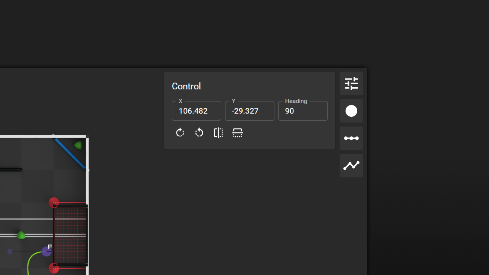
In addition, when an end control point is selected, the heading of the end control point can be edited. The heading is the direction in degree.
All input fields in the control accordion are computable input fields. The units are based on the unit of length setting.
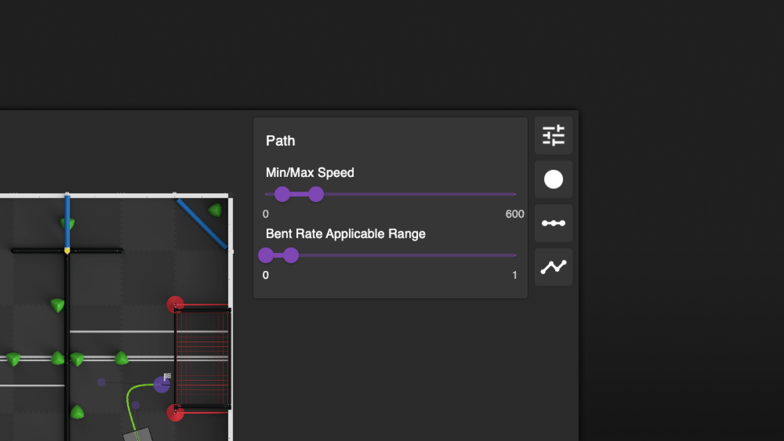
Path Config Panel
The Path Config Panel contains all the path configurations, including the minimum and maximum speed, the bent rate applicable range, and additional settings from the format you are using. To learn more about the speed and bent rate, please check out the Concepts > Bent Rate and Speed Calculation section.
Menu
The menu provides access to all the features of the editor. It is divided into four sections: File, Edit, View, and Help.
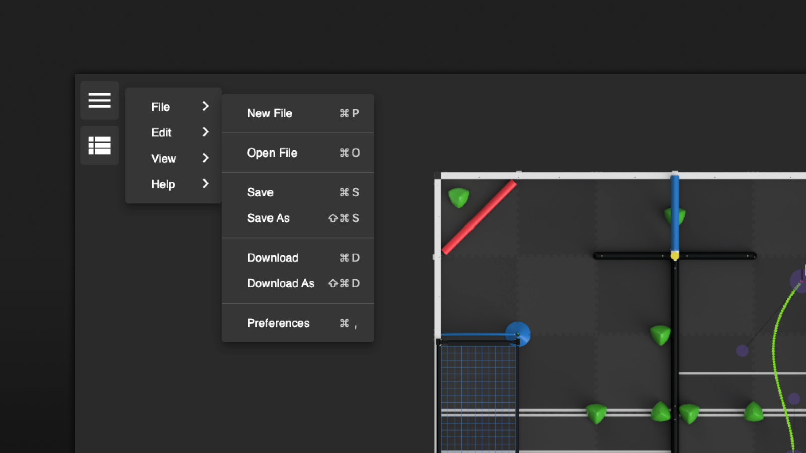
Open
Open opens an existing path file on your computer. After opening the path file, you can use Save next time to save the path to the same file.
Save / Save As
Save As brings up a file explorer, allowing you to choose the location and name of the path file to save to. Once the file is saved using Save As, you can use Save next time to save the path to the same file without bringing up the file explorer again.
Save As and Save are not supported on Firefox. They are replaced by Download As and Download.
Download / Download As
Download As downloads the path file to your computer and prompts you to choose the name of the file every time. Download downloads the path file and only prompts you to choose the name of the file the first time. Download is different from Save as it creates a new file every time.
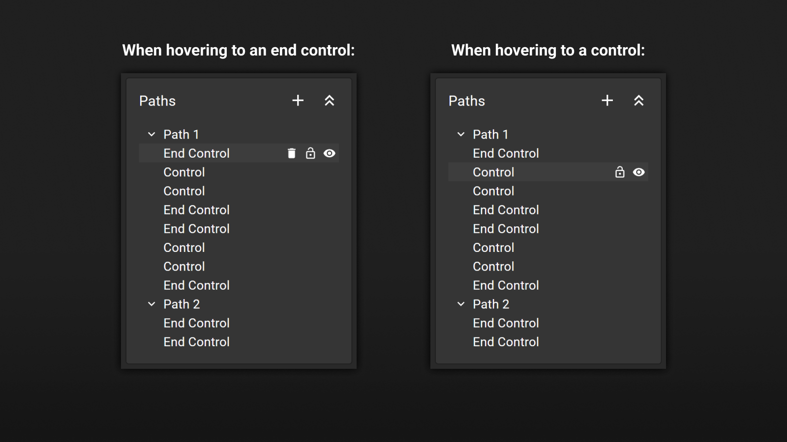
Path Tree Panel
The Path Tree Panel is a hierarchical representation of the paths and controls in the editor. The path tree can be used to select and edit paths and controls. A path file can contain multiple paths and all paths in the file are listed in the path tree.
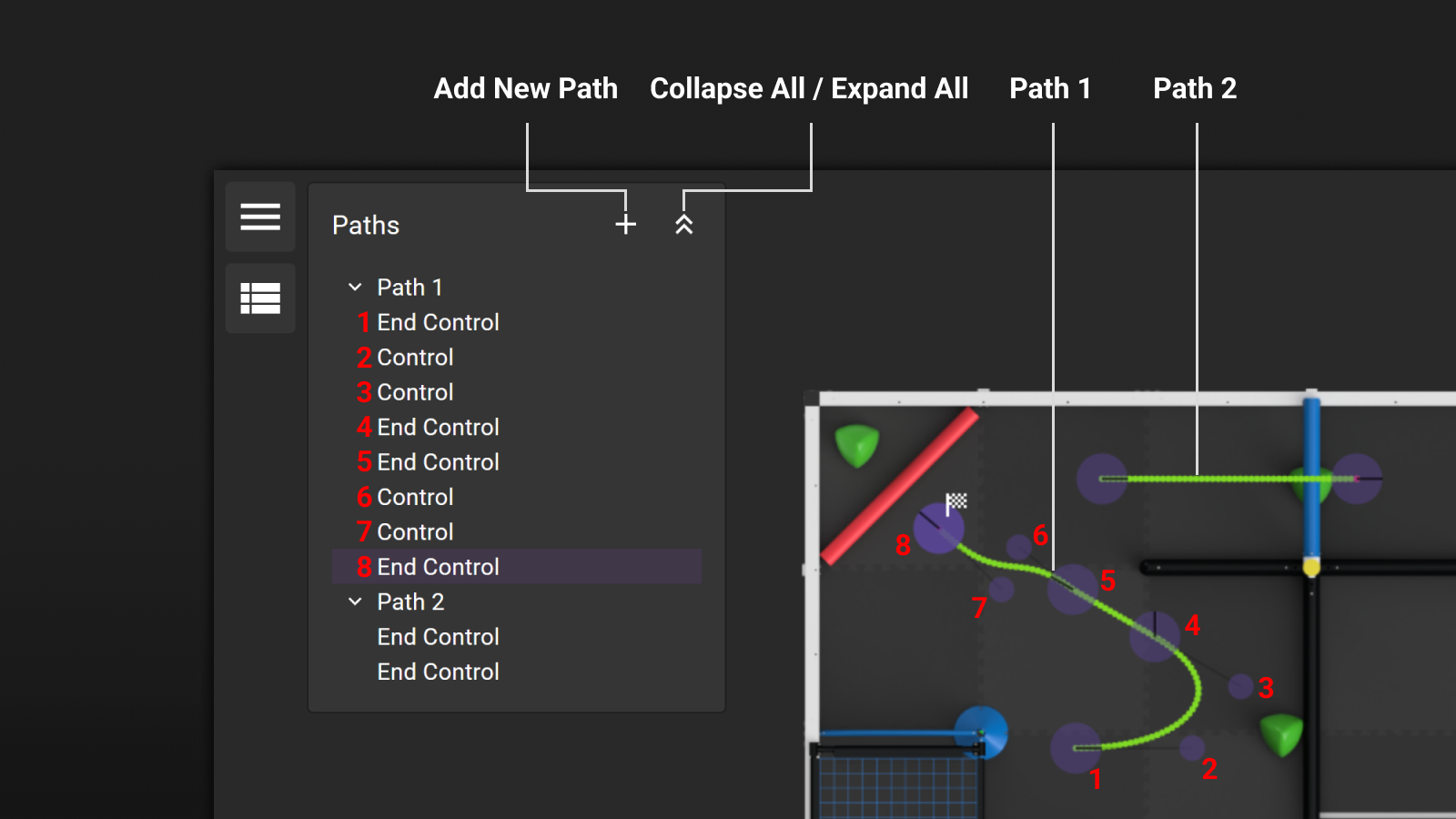
- Add New Path - Adds a new path to the path file.
- Collapse All / Expand All - Collapses or expands all the paths in the path tree.
In the above example, Path 1 has three segments, and Path 2 has one segment.
For Path 1, the first segment has two end controls and two controls. The second segment has two end controls. The third segment has two end controls and two controls. In total, there are eight items in Path 1. They are all listed in the path tree from starting point to destination, top to bottom.
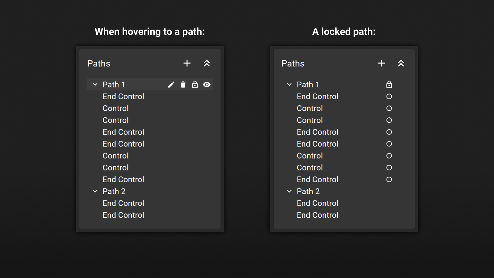
When you hover to an item in the path tree, the following options will be displayed:
- Edit Path Name (Pencil) - Edits the name of the path. This is only available when the item is a path.
- Delete Path (Trash Can) - Deletes the path/end control. This is only available when the item is a path or an end control.
- Lock Path (Lock) - Locks the item. When a path is locked, all its end controls and controls are locked. Locked controls cannot be selected. This is useful when you want to prevent accidental changes to the path.
- Show Path (Eye) - Shows or hides the item in the editor. When a path is hidden, it is not visible in the editor, but it is still visible in the path tree. This is useful when you want to hide a path temporarily.
Not all types of controls have the same options. For example, controls can not be deleted.
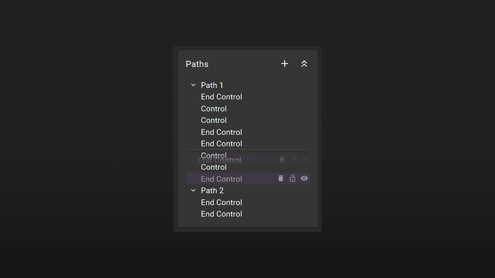
Paths and end controls are draggable. You can drag them to reorder them in the path tree. When you drag a path, all its end controls and controls will be dragged together.
After you drag an end control from one location to another location, the editor will automatically reevaluate the structure of the path and update the path accordingly. Only segments with two items or four items are valid. If the path is invalid, the editor will try to fix the path by removing control points.
Speed Graph
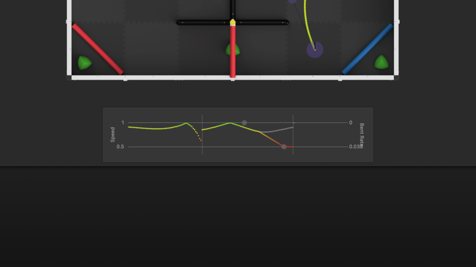
The Speed Graph is a graphical representation of the speed profile of the selected path. The speed graph can be used to edit the speed profile by adding speed keyframes on the graph. It is a dual-axis graph with the x-axis representing the position of the speed keyframe along the path and the y-axis representing the speed of the robot at that point.
On the left side, the y-axis represents the speed of the robot in the units of length per second. On the right side, the y-axis represents the best rate of the robot in rad/mm.
Each segment is separated by a vertical line.
You can add a new speed keyframe by clicking on the speed graph. A Speed Keyframe is an orange circle in the speed graph. It is a grey circle when the "Bent Rate Interruption" flag is set to true. You can drag the speed keyframe to change its position and left-click to toggle the "Bent Rate Interruption" flag. To delete a speed keyframe, you can right-click on the speed keyframe.
All waypoints along the path are displayed as colored dots in the speed graph. The color of the dot represents the speed of the robot at that point from red to green, where red is the minimum speed and green is the maximum speed. The longer the path, the more waypoints there are. You can scroll the speed graph to see more waypoints using mouse wheel or trackpad.
A Bent Rate Result is a grey dot in the speed graph. The bent rate is used to limit the target speed of the robot when the robot is making a turn. To learn more about the speed and bent rate, please check out the Concepts > Bent Rate and Speed Calculation section.
Computable Input Field
A computable input field is an input field that supports basic math operations and units. It is commonly used in the editor for inputting the point density, robot size, coordinates, and more.
It is very important to understand how the computable input field works: After you press enter, the input field will try to parse the input as a math expression. If the input is a valid math expression, the input field will evaluate the expression and display the result. Otherwise, the input field will display the input as it is.
For example, if the unit of length is set to centimeters and a control point is selected, the x coordinate input field will display the x coordinate of the control point in centimeters. Then:
- If you enter a value of
2into the input field, the x coordinate of the control point will be updated to2centimeter. - If you enter a value of
2ininto the input field, the x coordinate of the control point will be updated to5.08centimeter. - If you enter a value of
2+3ininto the input field, the x coordinate of the control point will be updated to7.08centimeter. In this example,2doesn't have a unit, so it defaults to centimeters.3inhas a unit of inch, so it is converted to centimeters.
The following operations are supported:
| Operation | Symbol |
|---|---|
| Addition | + |
| Subtraction | - |
| Multiplication | * |
| Division | / |
The following units are supported:
| Unit | Symbol |
|---|---|
| Millimeters | mm |
| Centimeters | cm |
| Meters | m |
| Inches | in |
| Feet | ft |
| Tiles | t |
Furthermore, brackets are also supported. For example, 2 * (3+4) is a valid input. The spacing between the numbers and the operators is optional. For example, 2*(3+4) is also a valid input.
A computable input field also supports using the up or down arrow keys to increase or decrease the value by 1. The increment or decrement amount is based on the unit of length setting.
Asset Manager
Assert Manager is a modal that allows you to manage all the assets used in the editor, such as field images.
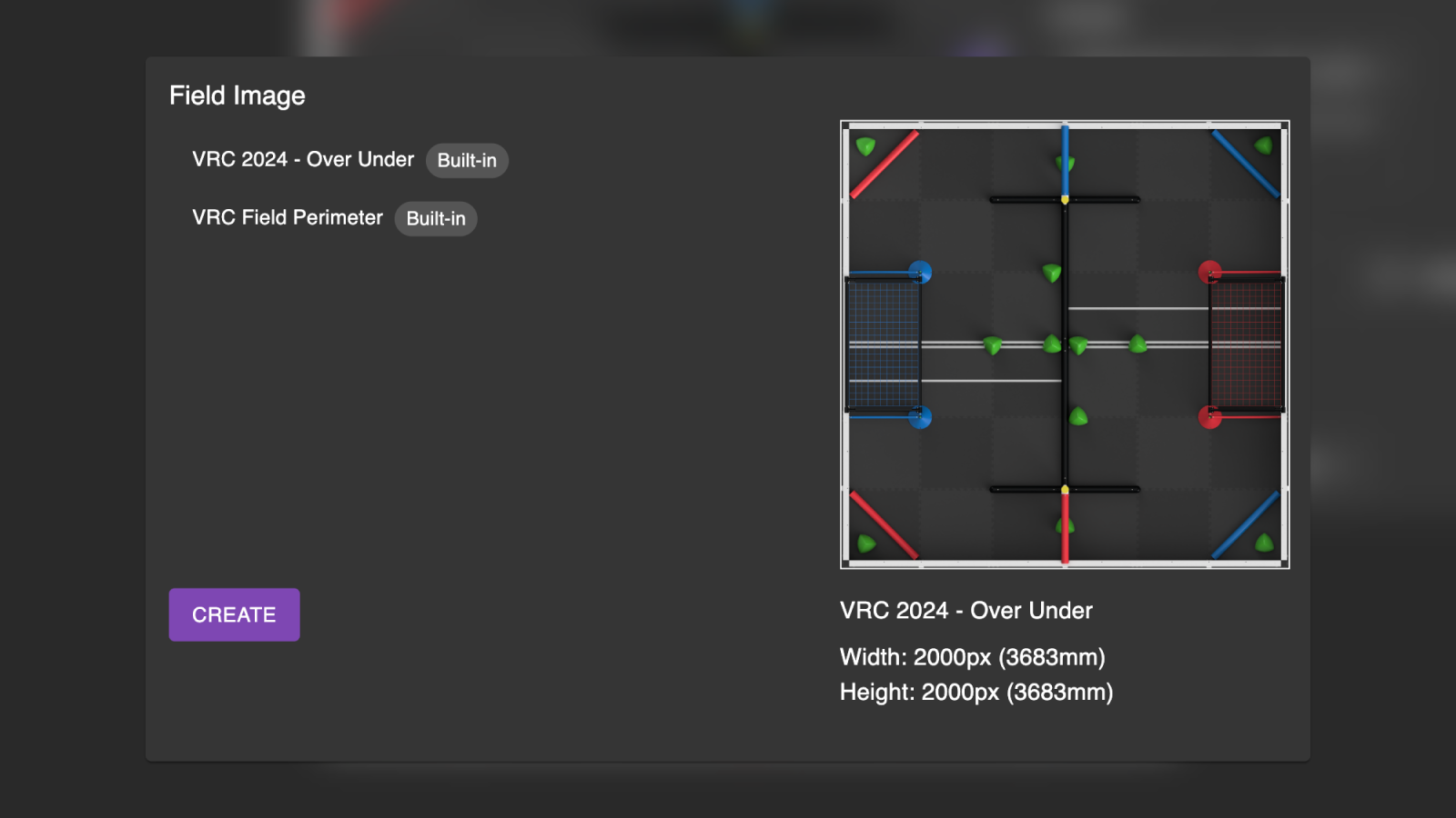
Field Images
PATH.JERRYIO has support for setting custom field backgrounds with custom sizes. This allows the software to be used with other fields from other robotics competitions, like FRC or FTC.
To change the field image, click on the field layer drop-down list in the General Config Panel and select the field you want to use. If you want to use your own field image, select the "custom" option.
This will bring up the Asset Manager. Click on the "Create" button under the "Field Image" section to add a new field image.
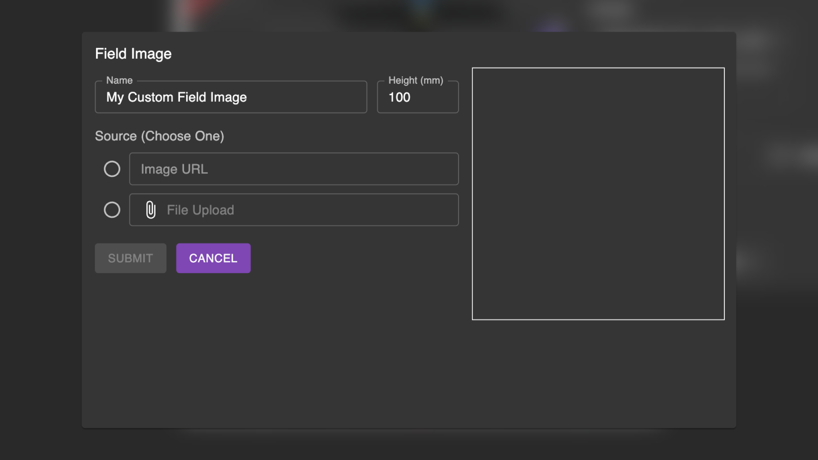
PATH.JERRYIO uses the real-world dimensions of your image in order to preserve the distance between points. As you switch between images, PATH.JERRYIO automatically adjusts the position of your points based on the dimensions of each image.
- Name - The name of the field image. It can be changed after the field image is created.
- Height in Millimeters - The height of the field image in millimeters in the real world. The width of the field image will be calculated automatically based on the aspect ratio of the image.
- Source - The source of the field image. It can be a URL or a file on your computer.
- If you are using a URL, enter the URL to the "Image URL" input field. You need to make sure the URL is accessible by the editor. If you want to share the path file with other people or open the path file on another computer, the URL must be accessible by other people or other computers.
- If you are using a file, upload the file to the "File Upload" input field. PATH.JERRYIO will store the file in your browser. If you want to share the path file with other people or open the path file on another computer, you need to upload the file again on the other computer.
PATH.JERRYIO will remember if a path file was created on a custom field. If you save a path file using a custom field and open it on another computer, The following dialog will be displayed:
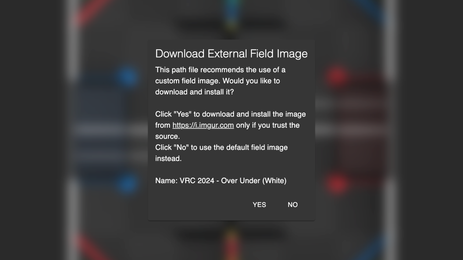
For security reasons, PATH.JERRYIO will not automatically download the field image from the URL. You need to click on the "Yes" button to download the field image. If you don't want to download the field image, you can click on the "No" button to use the default field image.
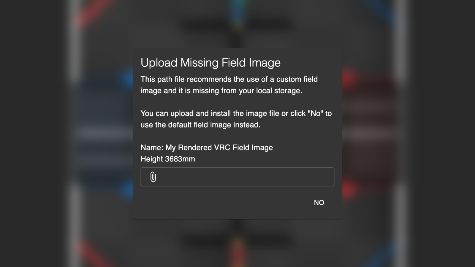
If the path file uses a custom field image and the field image is missing from the local storage, you need to upload and install the image file or click "No" to use the default field image. Although the path file doesn't contain the field image, it contains the field image's signature to verify its integrity. You need to upload the field image with the same signature to install the field image.
Field Canvas
The Field Canvas is the main canvas for drawing the paths. It is the canvas in the middle section of the editor.
Controls
| Shortcut | Description |
|---|---|
| Left-click on the field | Create a new cubic segment |
| Right-click on the field | Create a new linear segment |
| Right-click on a control | Delete the control point |
Segments
| Shortcut | Description |
|---|---|
| Left-click on a segment | Toggle cubic or linear segment |
| Right-click on a segment | Insert a control point / Split the segment |
| Shift + Left-click | Select multiple control points |
Panning & Zooming
The Field Canvas can be panned and zoomed using the mouse wheel or trackpad. You can zoom the Field Canvas by holding the Ctrl key and scrolling the mouse wheel or trackpad. Press Ctrl + Add to zoom in and Ctrl + Minus to zoom out.
If you are using a touch screen, you can pinch to zoom the Field Canvas. To pan the Field Canvas, you can press on the Field Canvas and drag your finger.
Field Image
The field image is displayed in the background of the Field Canvas. It can be changed in the General Config Panel. See more details in the General Config Panel section. To customize the field image, you can use the Asset Manager.
Controls Selection
Controls can be selected by clicking on them. Multiple controls can be selected by holding the shift key and clicking on them. Unselect a control by clicking on it again. Selected controls are displayed as bright purple circles. The selected controls can be dragged to change their position.
If you want to select all the controls in a segment, you can press Ctrl + A to select all the controls in the path. Press Ctrl + A again to select all the controls in the path file.
Area Selection
You can select multiple controls by dragging a selection area. To drag a selection area, you can left-click on the field and drag the mouse. All the controls inside the selection area will be selected. You can press Shift to add/remove controls from the selection area.
If you are using a touch screen, you can select multiple controls by pressing on the field and stay on the screen for a while. You can then see the animation indicating that you are dragging a selection area. After that, you can start dragging the selection area.
Control Carrying
Control carrying is a feature that allows you to carry the nearby small control points when dragging end control point(s). It is useful when you want to move the end control(s) without changing the shape of the segment(s). You can press Shift to disable control carrying when dragging end control(s)
If you are using a touch screen, this feature is enabled by default.
Magnetic Snapping
Magnetic snapping is a feature that allows you to snap the control points to the field image. When dragging the control point(s), you can press Shift to enable magnetic snapping. It is useful when you want to drag control(s) snapped to other control(s), heading direction, or previous position.
If you are using a touch screen, after you select the controls and drag them to the position you want to snap to, you can stay on the screen for a while and the controls will snap to the position automatically. To disable magnetic snapping, you can move the controls away from that position.